Translate

Search MOJO

Tuesday, 25 October 2011

Building a background in the dark...

Showing the background in the day light was one thing, but it's another to show the same scene but at night. It's not just as simple as turning down the brightness, but it is still quite a simple precess of adding hue and saturation levels to cover the image in blue shades, darkening some of the shadows to exaggerate the levels of depth further, and ofcourse adding stars, and the image seems to transform.

This was the background we were given re-create, but this time, at night...


Following the steps ofcourse made it fairly simle to recreate the look, but certain aspects didn't seem to work in the way wanted for my image, and other tweaks are still needed to get the image looking right and as close as possible to the original. So again, possibly leaving the image for a few days and coming back to it will allow me to look at it with fresh eyes and a fresh thought process on how to combat the problems...


Monday, 24 October 2011

Building a background...


For this next project, It's on to more software based outcomes- focusing now on backgrounds. Initially, it was a very daunting and seemingly complicated process that was ahead of us, to basically recreate a pre-exisitng background, building it from it's outline with colour, shading and textures to duplicate the image as closely as possible using Adobe Photoshop. But building the image up in layers breaks the image down into easy to register pieces, and when following the various steps and procedures, and almost being very perfectionist towards the details, the piece seemed to come together very quickly and respectively easilly, and ofcourse giving a clear insight into industry practices and procedures of creating backgrounds.

This was the image we were given to recreate...


To begin duplicating the image, we were given the drawn outlines for both the main background, and the forground area...


Then the process of building the image began. Through blocking the main colours and line colours, then adding hard and soft shadow, hard and soft light and creating textures by scanning sprayed watercolour paper and a painted piece of paper to place on the image, the piece began to come together and through tweaking and minor alterations, the piece began to look like the original...


Up to now the piece, I feel, is fairly similar to the original, but getting the colours, shadows and light effects to match the original background is very tedious and frustrating at times, and I feel there are still minor adjustments that could be made to colours and lighting in order to match the piece further. But coming back to the piece in a week or so may be beneficial to see with fresher eyes exactly what needs to be done.

Mobster from Dimension X...

For the second part of the storyboarding project, it was time for us to put a little of our own creativity and imagination into the look of the shots. Given a page of script from the Teenage Mutant Ninja Turtles episode, 'Mobster from Dimension X'...


... we were given the freedom to present the script in with any shots, camera moves and angles that felt neccesary for the script and story. The page which I was assigned had quite a simple yet interesting and exciting piece of action in it- featuring 5 characters- focusing mostly on the Glob father himself and 1 of the 4 surrounding gangsters. These being the only characters in my scene kept it quite straight forward in that sense as to who the scene and shots would be based on and would feature. The main bulk of the script focused around the Globfather's anger towards his gangsters, leading to one of them being morphed and melted into a puddle of slime by the Globfather...


This piece of action, although as simple as the gangster being touched and being turned into a puddle of slime by living goo from the Globfather, allowed me to play around with multiple camera shots and angles, experimenting with the relationship between the goo and the gangster and how the two come together. I really enjoyed exaggerating the life of the goo and how at times it looks, and even seems to tease the gangster before completely embrasing and taking over him. It was interesting to attempt to time out how long and how many shots it should take the goo to completely engulf the gangster, which was helped by intervining the action with reaction shots from the other 3 gangsters and the Globfather himself. But once started, it seemed quite a natural process of building up the action and the coverage of the gangster, helping pace the actiuon further with camera movement, pans and zooms, which would all keep the audience interested and in the action.

The rest of the scene was then concentrated on the Globfather telling the remaining gangsters about what he wants them to do and what he is willing to give them when they do it...


Overall, I really enjoyed the process and experimenting with different angles and shots that could tell the story in the best way. I felt that keeping the story and action flowing was interesting to me, and to see the plot come together and unfold the way I imagined it to was exciting. The attention to detail with the write up of the action, camera movements and timing, aswell as all of the action and camera movement arrows, was also great to get stuck into, getting in depth into how the character's emotions, actions and status's within the story could be best displayed and in the most dynamic ways for the audience to understand and keep interest. So after this project, I feel like this could be an area in which I would like to go into in the future, as It would allow me to possibly create the stories and scripts, and then also show how I would like it to come across on screen for an audience.

Thursday, 20 October 2011

Bursting with Berryness!


Project number 2- and we're on to storyboards. I'm feeling quite excited about this one- it seems, after looking at various examples from the industry, that this could be potentially an area I may consider venturing down in the future, so I'm eager to get going and see if it turns out to be what im expecting...

The project is split into two parts- the first of which is to pick an advert and storyboard it exactly as it appears on screen, acting as a sort of practice to get us used to the workings and structures of storyboards and how to create them effectively. the advert Ive chosen to use is the recent Ribena advert, featuring a variety of animated berry characters, all with one aim- to get to the berry laiden tractor trailor, and make it into the bottle of Ribena...


So from this, the storyboards had to represent camera movements, music and dialogue, timing  and the main action of the characters in each shot. It was daunting at first to know exactly how much detail was neccesary in each panel, and just how many panels were needed...


It feels now that I may not have needed so many panels, and that some of the actions were shown in more detail than neccesary for storyboard purposes, but with this excercise I feel I have learnt alot about the process of storyboarding and what is included in them, aswell as gathered a quick yet accurate drawing stlye that I feel kept me interested, keeping them form becoming too tedious and showing only the  main focus and details of each shot- using pen to highlight and make certian features more of a focus point than others.
I am happy with the way the storyboards turned out and am eager to begin work on the next one of the project, and add a bit of my own creativity to them.

Wednesday, 19 October 2011

The life and times of Morris Kane...


Now Morris Kane, creepy coroner extraordinaire, has taken shape, and it's time to bring him to life. Focusing on the emotions and actions suggested by the dialogue,


I continued to feel as if the expressions could have been pushed and exagerated further, but it simpley wouldn't have suited the character. With the few that were tried it seemed to take away from the character's personality and creepy status rather than add to it. So they were kept subtle and simple, and worked so much better- reflecting the character's rather laid back and intense nature, aswell as his creepy and slightly unstable mentality.

The character, now in place, begins to take shape more with the planning of just how he will move and what he will do in his animated segment. At first, the plan was to stand him behind the coroner's table, complete with dead body. But after acting out and filming reference videos for the scenario, the movements just didn't seem natural, and seemed forced. So when trying the actions sat down, they seemed to work alot better, allowing much more subtle actions and details that brought the creepy personality of the character to life.


The subtle movements make him seem incredibly creepy to me- the fact that he's simply stirring his cup of tea whilst speaking of death in his threatening tone, he seems so used to be surrounded by death that it no longer effects him, and has possibly even twisted him somehow into the sinister, slightly unstable character he is today. Using these thumbnails to put together for the animatic gives the first glimpse at how the character will look with the voice and how his movements and action will come together...


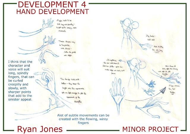
The animatic shows the main gestures and movements of the piece, but the subtle, more delciate details I feel will bring the character to life- the eyebrow movement- emphasizing the expression of his eyes, the long curling finger movement, his thin limbs delicately flowing around his body. All will hopefully come together to create the character I want and that will fit the voice successfully...so only time will tell...

Friday, 14 October 2011

The birth of Morris Kane...

So back to the minor project...
Someone said to me once, that creating a character is a lot like giving birth (not that I would know ofcourse)- It starts of with something small, and takes a long time to develop- suffering through the pain and frustration, particuly nearing the end stages. But once ready, you feel it, and the result suddenly all becomes worth it.

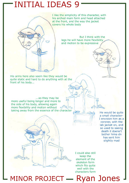
So after going through, well, quite alot of designs and developements for the character, from the evil villain character to the coroner, my designs were getting very complex, as they tend to do- with lines and details that weren't neccesary. I liked them, and some features and elements worked and suited the voice, but I had to think ahead to actually animating this character and drawing it repeatedly...


I started to get very repetative with the designs, even with a varied selection of research into villains, characters and artists, and started to loose direction and found it difficult to move on. In order to get past this, I had to begin to think simpler, think single shapes and rounded forms that were easier to draw and gave a much clearer look and character, only including details that were totally neccesary...


 The design in the top right hand corner of this design sheet interested me and seemed to work- a simple singular shape, with the character's personality still coming through. His small stature, at first, I didn't think would fit the voice, I wanted it to be more of a serious, darker edged character than  i've done in the past, but this desing still seemed to work and added a further visual pun to the piece, with him acting so serious and threatening, yet appearing so small and weedy. So development of the character began...


 The above design of the character was only a quick sketch, but really seemed to work for the character and seemed nice and rounded to draw. His shape and features were simple yet flexible enough for what was needed for the character and his personality. Now the features needed developing to see if anything else can be done with him.


 Several changes were made, but in the end they seemed to over work the character and take away from the inital feel of the sketch and character- overcomplicating his facial features more than anything to a point where it they became confusing and unclear. So the character was taken back to the previous design and tested in quick poses and sketches.


These sketches really seemed to work and fitted the character and dialogue and I felt I could get all of the expression and emotion from him when animating to fit with the voice succesfully, but without being too over the top, unclear and angular. So with a bit of tidying and polishing, heres the final character...


Now the character is born, the fun with him can begin, and Morris will become clearer with creation of the expression and pose sheets...