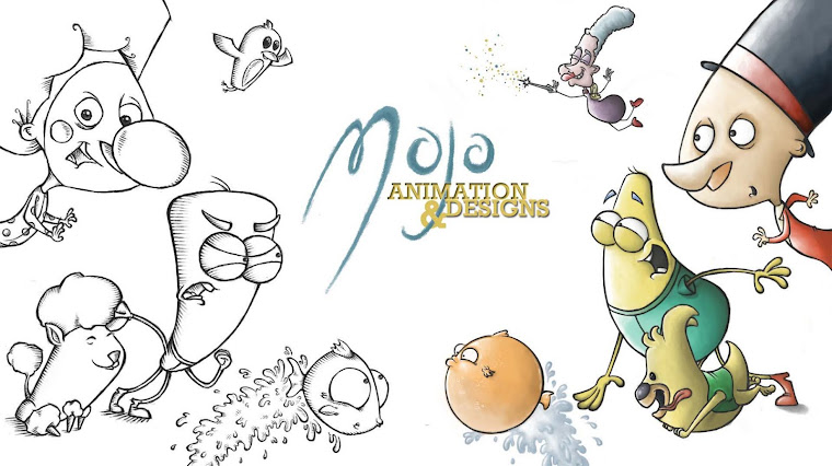
From the designs, I wanted the characters to look opposite in shape, form and colour so that there is a clear difference in the film...
The colours I also wanted to keep opposite, one lighter and jollier, and one darker, but still keep them both bright and inviting to keep the comedy essence of the film...
I want to push the expressions and actions of the characters as far as possible to give that quick paced, cartoonish style to the film...
Their simplistic shapes and features are easy to manipulate and exxagerate to perform the actions they need to. The large round eyes in particular give them the comedic expressions...


No comments:
Post a Comment