Translate

Search MOJO

Wednesday, 8 February 2012

Good day Bad day: style choices


Now that the story is in place, its just a matter of how the film will look...


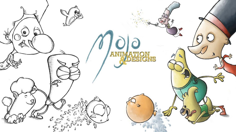
I really like this more cut out, 101 Damlmations style. Its quick, simple, gets the image across and would allow the characters to be the main focus...


Looking at some of my favourite short films by BirdBox animations gave me the idea for this style, which I love- it fits the theme and nature of the film, and the characters would definatly fit in and take over as the main focus. They suit the sketchy feel and look that I want for the film overall...

Good day Bad day: thumbnails


These are the initial ideas for the film, and what will happen to the two characters. I have to keep in mind that the two characters will be on screen at the same time, so whatever they are up to, the two cant be doing main actions at the same time, but also one cant be stood still while the other is doing something...


All the sequences wont be able to be used, so I picked the one that seemed to have alot of potential and developed it further...


But just the one sequence, with one stationary shot for a minute and a half might get quite boring for audiences, so I want to pick a few of the original sequences, but cut them down, give a faster pace and piece together the film and story with them...


Saturday, 4 February 2012

Good day, Bad day: Final characters

From the designs, I wanted the characters to look opposite in shape, form and colour so that there is a clear difference in the film...


The 'bad day' character has more sharper edges on features such as the hands, and has the same body shape as the 'good day', but upside down...


The colours I also wanted to keep opposite, one lighter and jollier, and one darker, but still keep them both bright and inviting to keep the comedy essence of the film...


I want to push the expressions and actions of the characters as far as possible to give that quick paced, cartoonish style to the film...


Their simplistic shapes and features are easy to manipulate and exxagerate to perform the actions they need to. The large round eyes in particular  give them the comedic expressions...


Sunday, 29 January 2012

A bad day becoming good...

The split screen film seems to be an idea that works alot better than the original Kane premise. But again, the film would have to show the relationship between the villain and hero somehow, and Im struggling to think of an ending for it that works.

Therefore, I still want to use the same premise, the split screen showing two characters as they go about their routines and how their days go differently, but the idea came to me to keep it alot simpler, and to focus simply on one character having a good day, the other having a bad day.

This will hopefully allow for comedy elements, and I want it to be a film that is very similar in timing and actio  to classic caroons, like loony toons, or Spongebob Squarepants. I want it to be exaggerated comedy, pushing the reactions and actions of the characters. In order to get so much action and fast paced movement that comes across to audiences clearly, I want the characters to stay simplified, made of simple shapes.