Translate
Search MOJO
Wednesday, 7 December 2011
E4 sting 2
E4 sting
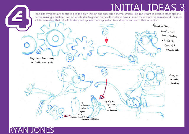
Next we're creating an E4 sting, a short piece that fits between programmes. It has to fit with the quirky nature of E4 and fit their target audience...
I like the fish idea- I think its simple, bold, effective, and could be quite funny, and stylistic to fit with E4...
Tuesday, 29 November 2011
sack magique...
sacks- not exactly what you would instantly think of as animatable, but we were given the task of adding life and personality to these inanimate objects. Both sacks had to get across a ravine or space of some sort, but showing two different personalities- one adventurous and keen to get across (wearing an Indiana Jones style hat, or so I'd hoped)...
...the other- nervous, weak, slightly unsure about jumping across a gaping hole in the
ground. Both still had to recognisable as sacks, not pushed so far that they lost their properties or forms as fixed pieces of cloth, but had to somehow work, or hop along the ground, using their corners as 'feet' or 'arms' to give a sort of indication as to what they were feeling or doing.
Their speed and subtle movements and stances had to be the main way to tell, not only what they were thinking and give away their personality, but also to tell between the two of them, as they both had to look the same, apart from a slight difference in weight. Trying to portray two different personalities with two characters that look the same, and are essentially inanimate objects was the real challenge, but it was one that made you think more about the subtle movements and traits that show off a character rather than just how they look.
Its a shame the final film turned out very dark due to the number of layers used in flipbook, its hard to see the movements.
Wednesday, 9 November 2011
Ryan Jones and the Temple of Illustrator...
Illustrator- a piece of software untouched so far, so this project, from the start, was daunting. Having just become adjusted to photoshop, it was challenging to see how different illustrator was, and how much of a different working system was needed for it.
For this project, it was our own backgrounds that would be created, and I wanted to create mine based on the 'sack' animation that will be done next. The sacks will need to be animated jumping across some sort of ravine or cavern, basically jumping across from one area to another. So rather than stick with the traditional hillside, grassy area with a cracked ravine down the centre, I wanted to try something different and create a landscape that the characters could easilly interact with and become part of.
I thumbnailed some quick ideas about what I initially wanted the sacks to eventually do, and went through various ideas from riding a cart on a broken mine track, to leaping across temple ruins chased by a giant boulder, from walking and falling from a rickety bridge, to swinging across trees with the branch falling on them. But I was really interested in the temple idea and making it more of an Indiana Jones style scene to keep it interesting and different.
So this was the sketch of the final background.
Initially, I had drawn up a background scene for behind the main temple, which included a flowing waterfall topped with further ruin areas, and backed with a mountain range. But placed together, the scene became very crowded and cluttered, taking attention away from the main focus of the background and making it confusing as to what was going on. So instead, I tried a more subtle, simpler background that seemed to fit well- adding further landscape and depth to the scene, whilst also keeping attention and focus mainly on the temple.
The design and shapes of the deepest part of the background went through various stages, but were kept as simple as possible so as not to overcomplicate or get in the way of the main image, but also add to the detail and look of the overall piece, adding depth.
It was quite difficult to juggle how much detail to include on the main rocks and temple area without it either becoming unrecognisable, or too overcomplicated and detailed. Keeping the style angular and quirky seemed to suite not only the background but illustrator aswell.
The flowers ion the foreground then added the last element of depth- keeping them fairly detailed, and brighter to stand out and keep the depth as much as possible. the sky in the background is soft and kept faint, with a slight blurred effect, with the main temple using brighter colours and harsher lines to seperate it, and further still with the foreground, so that the image overall has an element of depth.
The overall image I am very happy with, for a first attempt at illustrator. The colours all seem to work, and the three layours all seem to fit together. However, the foreground could be seperated further, and the sun could be made to fit further, with harsher lines. But with this project I have learnt the basics and got my head around illustrator and the process of working in it which should help for future projects.
Tuesday, 25 October 2011
Building a background in the dark...
Showing the background in the day light was one thing, but it's another to show the same scene but at night. It's not just as simple as turning down the brightness, but it is still quite a simple precess of adding hue and saturation levels to cover the image in blue shades, darkening some of the shadows to exaggerate the levels of depth further, and ofcourse adding stars, and the image seems to transform.
This was the background we were given re-create, but this time, at night...
This was the background we were given re-create, but this time, at night...
Following the steps ofcourse made it fairly simle to recreate the look, but certain aspects didn't seem to work in the way wanted for my image, and other tweaks are still needed to get the image looking right and as close as possible to the original. So again, possibly leaving the image for a few days and coming back to it will allow me to look at it with fresh eyes and a fresh thought process on how to combat the problems...
Monday, 24 October 2011
Building a background...
For this next project, It's on to more software based outcomes- focusing now on backgrounds. Initially, it was a very daunting and seemingly complicated process that was ahead of us, to basically recreate a pre-exisitng background, building it from it's outline with colour, shading and textures to duplicate the image as closely as possible using Adobe Photoshop. But building the image up in layers breaks the image down into easy to register pieces, and when following the various steps and procedures, and almost being very perfectionist towards the details, the piece seemed to come together very quickly and respectively easilly, and ofcourse giving a clear insight into industry practices and procedures of creating backgrounds.
This was the image we were given to recreate...
To begin duplicating the image, we were given the drawn outlines for both the main background, and the forground area...
Then the process of building the image began. Through blocking the main colours and line colours, then adding hard and soft shadow, hard and soft light and creating textures by scanning sprayed watercolour paper and a painted piece of paper to place on the image, the piece began to come together and through tweaking and minor alterations, the piece began to look like the original...
Up to now the piece, I feel, is fairly similar to the original, but getting the colours, shadows and light effects to match the original background is very tedious and frustrating at times, and I feel there are still minor adjustments that could be made to colours and lighting in order to match the piece further. But coming back to the piece in a week or so may be beneficial to see with fresher eyes exactly what needs to be done.
Mobster from Dimension X...
For the second part of the storyboarding project, it was time for us to put a little of our own creativity and imagination into the look of the shots. Given a page of script from the Teenage Mutant Ninja Turtles episode, 'Mobster from Dimension X'...
... we were given the freedom to present the script in with any shots, camera moves and angles that felt neccesary for the script and story. The page which I was assigned had quite a simple yet interesting and exciting piece of action in it- featuring 5 characters- focusing mostly on the Glob father himself and 1 of the 4 surrounding gangsters. These being the only characters in my scene kept it quite straight forward in that sense as to who the scene and shots would be based on and would feature. The main bulk of the script focused around the Globfather's anger towards his gangsters, leading to one of them being morphed and melted into a puddle of slime by the Globfather...
This piece of action, although as simple as the gangster being touched and being turned into a puddle of slime by living goo from the Globfather, allowed me to play around with multiple camera shots and angles, experimenting with the relationship between the goo and the gangster and how the two come together. I really enjoyed exaggerating the life of the goo and how at times it looks, and even seems to tease the gangster before completely embrasing and taking over him. It was interesting to attempt to time out how long and how many shots it should take the goo to completely engulf the gangster, which was helped by intervining the action with reaction shots from the other 3 gangsters and the Globfather himself. But once started, it seemed quite a natural process of building up the action and the coverage of the gangster, helping pace the actiuon further with camera movement, pans and zooms, which would all keep the audience interested and in the action.
The rest of the scene was then concentrated on the Globfather telling the remaining gangsters about what he wants them to do and what he is willing to give them when they do it...
Overall, I really enjoyed the process and experimenting with different angles and shots that could tell the story in the best way. I felt that keeping the story and action flowing was interesting to me, and to see the plot come together and unfold the way I imagined it to was exciting. The attention to detail with the write up of the action, camera movements and timing, aswell as all of the action and camera movement arrows, was also great to get stuck into, getting in depth into how the character's emotions, actions and status's within the story could be best displayed and in the most dynamic ways for the audience to understand and keep interest. So after this project, I feel like this could be an area in which I would like to go into in the future, as It would allow me to possibly create the stories and scripts, and then also show how I would like it to come across on screen for an audience.
Subscribe to:
Posts (Atom)


