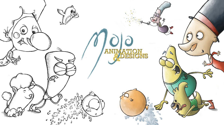
Showtime is becoming a little too long, and therefore things need to be sacrificed. I dont really want to get rid of any of the story itself, so it felt that the title section , in which the hand of the animator was originally seen coming in and preparing himself to draw the film, will be cut to just a simple shot of the animators desk, displaying art and design work for the film, with the titles then fading onto screen before zooming into the blank page for the film to begin. This will keep it simple, clear and still get the message across of the film being drawn straight onto the page without leaving audiences having to wait too long for the film to kick off...

These are just rough versions of the background, but they show the general idea of how it will look when complete, using a blocky, bold, colourful style similar to that of fifties cartoons and the work of Cartoon Modern, so that it contrasts the sketchy look of the main film itself and shows the seperation of the real world of the animator and the drawn world of the character.


No comments:
Post a Comment